
Creating a peaceful and relaxing atmosphere in your home often starts with the colors you choose. Calm colors can transform any space into a soothing retreat, helping you unwind after a busy day and promote a sense of well-being. Whether you’re repainting a room or selecting new décor, choosing the right colors is a key step in designing a tranquil environment.
In this post, we’ll explore helpful tips for selecting calm colors for your home, share ideas on how to use them effectively, and guide you through common pitfalls to avoid.
Why Choose Calm Colors?
Calm colors are usually soft, muted, and gentle on the eyes. They promote feelings of relaxation and harmony. When you surround yourself with peaceful hues, it can help reduce stress and create a welcoming ambiance.
Popular calm colors include:
– Soft blues
– Gentle greens
– Light grays
– Warm beiges
– Soft lavenders
– Dusty pinks
These colors mimic natural elements like the sky, water, and plants, which naturally evoke tranquility.
—
Tips for Choosing Calm Colors for Your Home
1. Consider the Mood You Want to Create
Each room serves a different purpose, so think about how you want to feel in each space:
– Bedroom: Opt for soft blues, pale greens, or creamy neutrals to promote restfulness.
– Living Room: Choose warm neutrals or muted earth tones for inviting comfort.
– Bathroom: Cool shades of blue or seafoam green can create a spa-like calm.
– Office: Light grays and soft greens encourage focus without overwhelming.
Knowing the mood you want helps narrow down your color options.
2. Use Color Samples and Test Patches
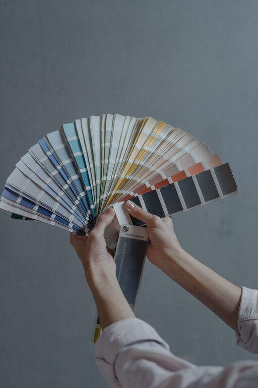
Colors can look very different depending on lighting and room size. Before committing, buy small paint samples and apply test patches on the walls where you plan to paint. Observe the colors at different times of the day and under different lighting conditions to see how they appear.
3. Stick to a Limited Color Palette
Using too many colors can make a space feel busy and chaotic. For a calm room, select two or three complementary calm colors. This creates harmony and balance. For example, pair a soft gray wall with white trim and a touch of muted green in accents like pillows or curtains.
4. Choose Matte or Satin Finishes
Shiny or glossy paint finishes can reflect light too strongly, making colors feel harsher. Matte or satin finishes absorb light softly, enhancing the calming effect of the color on your walls.
5. Incorporate Natural Elements
Combine calm colors with natural materials like wood, stone, or cotton for added warmth. The textures and organic feel of these materials complement calm color schemes beautifully and contribute to a serene atmosphere.
—
Popular Calm Color Combinations
Here are some tried and true color pairings that work well for creating calm interiors:
– Light blue + soft white + sandy beige
– Sage green + light gray + natural wood tones
– Lavender gray + cream + pastel pink accents
– Warm taupe + ivory + muted olive green
– Pale aqua + soft gray + brushed nickel finishes
—
Using Calm Colors Beyond Walls
Walls aren’t the only place for calm colors. Consider these ideas to enhance your room’s peaceful vibe:
– Furniture: Upholstered pieces in soft colors invite relaxation.
– Textiles: Curtains, rugs, and throw pillows in muted tones add layers of calm.
– Artwork: Select pieces with gentle color palettes and soothing themes.
– Accessories: Vases, lamps, and decor items in pale colors provide subtle touches of calm.
—
Common Mistakes to Avoid
– Choosing colors that are too dark: Dark colors can create a heavy or gloomy feeling rather than calm.
– Ignoring lighting: Natural and artificial lighting affect how colors look, so always test them.
– Overloading with patterns: Too many busy patterns can disrupt the calm atmosphere.
– Forgetting personal preference: Your space should feel comforting to you, so trust your instincts.
—
Final Thoughts
Choosing calm colors for your home is a wonderful way to create a peaceful sanctuary. By considering mood, testing colors, limiting your palette, and mixing in natural elements, you can design spaces that feel restful and welcoming. Remember, calm doesn’t have to mean boring—soft shades can be rich and engaging while still inviting relaxation.
Take your time experimenting with colors and enjoy the process of making your home a calming retreat you love to come back to.